In this article, we will consider a simple but informative method of studying the general structure of multidimensional data, searching for abnormal numbers and description of general trends. This method uses dispersion diagrams (correlation diagrams). This method depicts every point of researched sample, thus, it's quite demonstrative. One can easily see conglomeration of points (clouds, clusters), which have similar parameters. We applied this method to research the results of voting during special elections of the President of Ukraine.
We used the programming language R for the analysis and creation of diagrams. The data, similarly to the previous researches, were taken from the site of the Central Election Commission of Ukraine. The primary sample includes only those precincts located in Ukraine. Overseas polling stations don't fit into the diagram data structure, as long as their turnout is much higher than on Ukrainian ones.
When visualizing dispersion diagrams, we depicted the density of points, not every point separately. We explain such approach by the large number of points, which would overlap and merge into a single spot. To depict the density, we used the following colors: dark green, green, blue, purple, red, and yellow. Besides that, the diagrams contain first 500 points which are in the less compact zone.
The first visualization depicts the correlation between the number of registered voters and number of votes given for Petro Poroshenko:
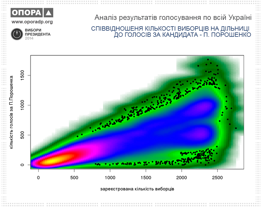
The diagram shows lines of accumulated points which show two separate trends in the voting. The first thought - is division into eastern and western Ukraine. It's interesting that both trends show that voters purposefully support Petro Poroshenko, and the number of votes in favor of this candidate increases relatively to the size of polling stations. Two distinctly visible clouds are located in "large" polling stations, and are typical for large cities of eastern and central-western Ukraine. It's also easy to notice the increased support in the east, and especially west.
The next diagram is visualizing the relation between voter turnout (column "participated") and number of voters given for Poroshenko:
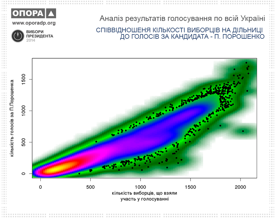
This diagram shows the distinct support of voters. However, despite the voter turnout is "fading" at some polling stations, the support is high anyway.
The diagram of votes given for Yuliia Tymoshenko looks radically different:
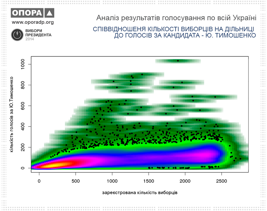
The trend of increased support at large polling stations is quite weak. Some incidents which show the "increase on one vote when increased on one voter" (points located on the angle of 45°) - are characterizing polling stations with abnormally high support of Yu. Tymoshenko. We wrote about such polls in previous articles.
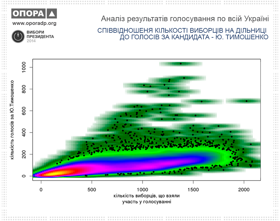
The results of voting for Yuliia Tymoshenko look like this:
To compare these results with previous candidates, we created dispersion diagrams for voting in favor of Oleh Liashko:
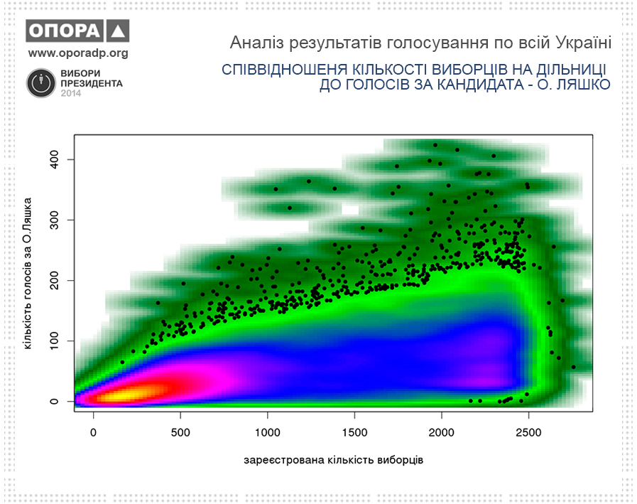
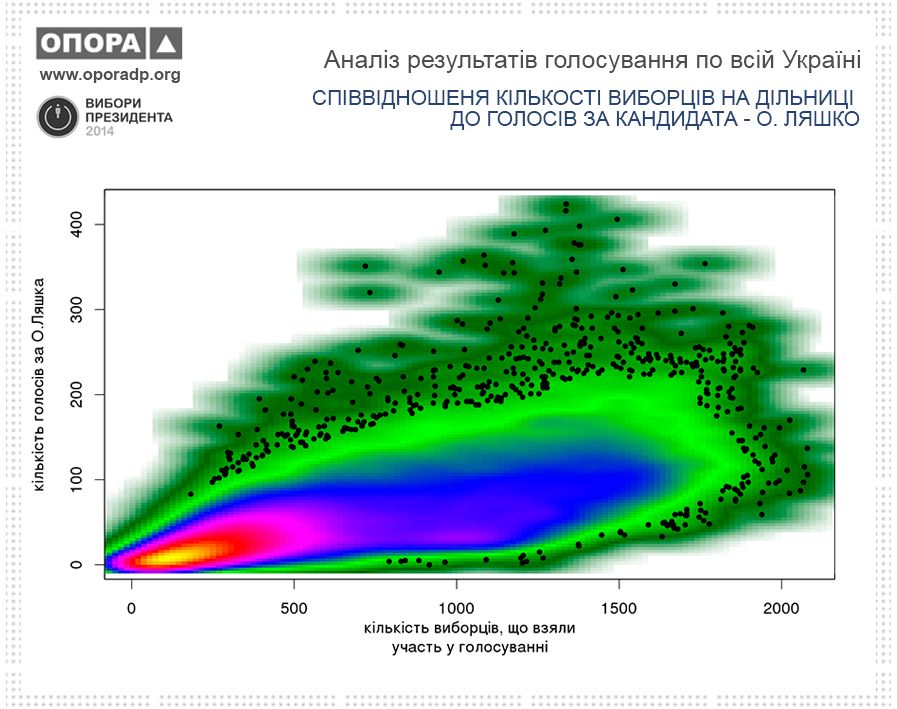
As we can see from the diagrams, electoral support of Oleh Liashko is not very distinct and strong as Petro Poroshenko's. However, the dispersion diagram "votes-turnout" is more shapeless than of Yuliia Tymoshenko: there are no separate conglomerations with abnormal numbers or other artifacts.
The material is prepared by:
Vasylenko Yevhen – Analytical Department Manager of the CN OPORA in Dnipropetrovsk oblast
+38 096 920 48 20 (Number of CN OPORA in Dnipropetrovsk oblast)